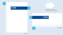
Layout Principle

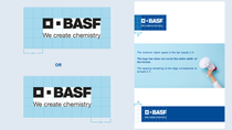
The only element allowed in the logo bar is the BASF logo. All other elements must be integrated outside the logo bar, and this applies to online and offline communication.
The height of the logo bar is determined by the longest side of the media on which you want to place it.
- 10 % of the length of the longest side corresponds to the height of the bar.
- At the same time, the height of the logo bar determines the logo size including the protected space.
- In case of special formats, please use an imaginary rectangle with a comparable area.
- Even when the logo bar is placed extremely far to the top or bottom, it must be ensured that the background remains visible above and below the logo bar.
- In case of extreme ratios there might be the possibility to adadpt the size of the logo bar (10% rule), e.g. long stages or hallways.

The logo bar should be differentiable from the logo pin, and must therefore always be longer from one side.
- The minimum blank space on one side of the bar equals 2/6 of the width of the logo, illustrated by 2 X below.
- The logo bar appears in the largest size possible, but it does not cover the entire width of the format. A minimum blank space of 2 X should remain to the edge.
- In case of extreme ratios there might be the possibility to adapt the length of the logo bar.

Placement of text
Text can be placed anywhere in the format, but never in the logo bar and this applies to all types of communication material.
For better legibility you can use a logo bar box which than needs to be attached above or below the logo bar.
Optional transparency
- Unsettled or colored backgrounds can make the text harder to read. To avoid this from happening, you can place the title text on a white logo bar box.
- Choose the opacity for the logo bar box to suit both the legibility of your text elements, and the desired visibility of the background picture showing through the logo bar box.


