Font
Content
On this page you can find the following topics:
New Helvetica
Using BASF’s Corporate Typeface
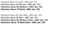
We use the eight fonts of New Helvetica shown here because of their excellent legibility and their timeless design features. They are well suited for all topics and themes we address.
Any of these fonts can be used if no exceptions have been defined for the media you are creating.
All companies operating under the BASF corporate brand use the corporate typeface. Other companies may have different rules.
Note: Helvetica Condensed type faces have been dropped due to license restrictions and are no longer to be used.

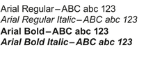
Arial
for office communication
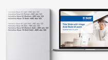
For office communication we use Arial in order to ensure an optimal exchange of standard office documents.
The attributes italic, bold and bold italic can be used if they support the content.
Arial Rounded and Arial Black must not be used, as they do not resemble the New Helvetica typographically, and therefore not support the perception of the BASF brand.
Arial must not be used for market communication or in any other form "outside" of the Microsoft environment.

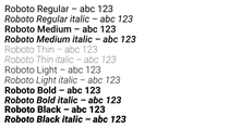
Roboto
for digital applications
For digital applications we can use as well Roboto in order to ensure a correct display. Roboto is not to be used in other communication materials.
The use of Roboto Condensed is impermissible because they don't correspond typographically to the New Helvetica.
Please note that, for data protection reasons, you should always use the static version of Roboto. If you wish to use Roboto Variable Font, please contact Florian Twardy (CL).

Alternative fonts
for non-latin writing systems
For countries with non-latin writing systems the responsible specialist function of the respective regional division defines the typeface which is to be used. It must be assured that a valid license is in place or that the use of open fonts is in line with our data protection requirements.

Handwritten fonts
for a human touch in communication (mindful use)
Handwritten fonts can bring a personal and approachable feel to both internal and external communications. When used thoughtfully, they enhance the message and foster a more human connection. However, their application should be mindful, avoid overusing them or employing them purely as decorative elements without a clear purpose.
A notable example of this thoughtful use is the #makeitcount strategy campaign, where the handwritten fonts were inspired by CEO Markus Kamieth’s personal handwriting. These fonts were designed specifically for that campaign to reinforce its personal and authentic tone. As such, they are exclusive to #makeitcount and must not be reused in other contexts or communications.
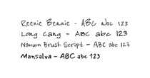
If you believe your campaign would benefit from this human touch, we recommend using the following Google Fonts: Reenie Beanie, Long Cang, Nanum Brush Script and Mansalva (downloadable files below). These fonts are free of charge and offer a similar personal touch while ensuring accessibility and design coherence.
.png?vid=WivkSa66htq7rmCGUTD6ZOgKTMorKLUC)
If you choose to use other handwritten fonts, they should align with the visual tone of the recommended options: clean, legible, and informal without being overly stylized.
Important Usage Guidelines:
- Handwritten fonts are not considered official brand elements. Their use is optional and should not replace our core corporate fonts in formal or brand-defining materials. Thus, they should be treated as secondary fonts, used in addition to Helvetica, which remains the primary font for all market communication materials.
- They are to be used exclusively in market communication campaigns. They should not be used in other touchpoints such as emails, presentation slides, applications, or any other internal or external communication formats.
- Their use should be considered as special cases and should not be seen as a default solution for adding a human touch to communication. Each use should be evaluated carefully and preferably in consultation with your brand champion, to ensure it aligns with our visual identity and communication goals.
Please ensure that all Google Fonts are hosted locally on your server. Dynamic integration is not compliant with DSGVO (General Data Protection Regulation) standards.
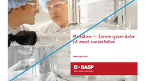
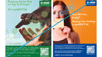
Don'ts

Font licences
Be aware that the Corporate Fonts are licenced.
The procurement of font files is handled the same way as the procurement of other software. The licenses are managed centrally by GD. Passing font files to external partners is impermissible. Individual brands need to assure respective licensing for their used fonts.
Contact for licenses: martin.unger@basf.com
Contact for mobile applications: mobile-solutions@basf.com
BASF Employees
For further information or questions, and if you want to obtain font files, please contact: brand-consultants@basf.com
External Parties
Designers, agencies and other external parties who create artwork or publications for a BASF group company, have to purchase a license for the New Helvetica fonts.

Text Layouts
Create recognizability: less is more
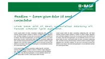
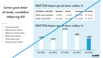
For most communication materials it is sufficient to use a small variety of type weights or sizes. Here, typography supports the messaging hierarchy.
- Format body copy in light and with adequate leading.
- Do not tighten or loosen tracking.
- Paragraph spacing uses a single hard return, as does the header.
- Subtitles must be the same leading as body copy.
- Use corporate colors sparingly to create emphasis or messaging hierarchy.
- Always use black for body copy on a white background, and white when reversed out of a corporate color.
- In long and very complex documents, when creating a new paragraph, use an indent at the start of each new paragraph, unless it is preceded by a subtitle. In this case, use a full line break between paragraphs.
