Web Accessibility meets our Visual Style
In support of an inclusive brand
Aligned with our commitment to promoting diversity and inclusivity within our organization, we have incorporated additional considerations on web accessibility standards into our branding guidelines.
It is important to note that the guidelines presented are currently recommendations and not mandatory rules.
Compliance with the WCAG 2.1 Level AA standards is sufficient to fulfill legal requirements at this time. Nonetheless, we believe it is crucial to adopt a proactive approach to prepare for future compliance and demonstrate our commitment to workplace equality, fostering an environment where every individual is valued and included.
For more information about Web Accessibility visit:
Web Accessibility
For more information about Digital Accessibility in general visit:
Digital Accessibility
When it comes to web accessibility, three common mistakes must be considered:
...causes, that people with visual impairments cannot read or understand illustrations and texts as they cannot differentiate between colors.
Missing ALT texts...
...causes, that impaired people cannot understand the information and function of an image.
Non-intuitive webpage structure...
...causes, that impaired people cannot perceive visual cues or navigate through complex structures easily.
Below we present the basic guidelines for addressing each of the three mistakes mentioned above:
1. Color Contrast
Make sure the minimim contrast ratio between colors is reached.
To ensure a cohesive and accessible design across all brand touchpoints in digital media, it is recommended to maintain a minimum color ratio between text and background to enhance readability. That should be achieved by observing the following general rules:
- Prioritize the use of full-tone corporate colors over different tints.
- Avoid combining the lighter corporate colors (orange, light blue, light green) with white/pastel/light gray shades; use black instead.
- Avoid combining darker corporate colors (red, dark blue, dark green) with black/dark gray shades; use white instead.

Please note that, despite these recommendations, our general guidelines on the use of colors (Corporate Colors) remain unchanged. You may keep using different tints of our corporate colors, color pairs and gray tones, but in such cases, it is advisable to use online contrast testing/checker tools to adjust colors accordingly.
Taking the basic color contrast principles into consideration will guarantee that our digital touchpoints are web accessible from the beginning.
This is NOT particularly crucial for webpages, as our websites are equipped with an accessibility switch feature located in the top menu bar, which transforms the entire page into a black and white mode with high contrasts, enhancing readability for all users. Yet, certain touchpoints (like Powerpoint presentations) may not provide this functionality, highlighting the significance of incorporating web accessibility principles into the design process.
For detailed guidelines on combining our 6 corporate colors and their tints with themselves, with white, and with black, please refer to the document available for download at this link: Web Accessibility x Visual Style - Color Contrast
Note: The BASF logo remains unaffected by these standards; thus, all six versions of color pins or color bars are permissible for use at any case.
Examples illustrating the application of this general rule across four different touchpoints are provided below.
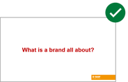
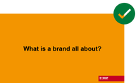
1.1. Presentations
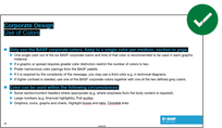
For normal text (<18pt), the best option is black or dark gray.
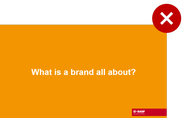
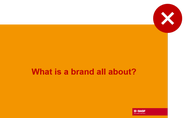
As an alternative, you can utilize the 'text highlight color' feature in PowerPoint to emphasize the lighter corporate color fonts against a black background.
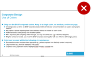
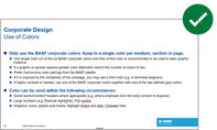
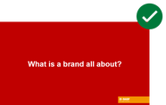
It is recommended to use the darker corporate colors with white.
1.2. Websites
On websites and applications, webpages which use as primary colors one of the lighter corporate colors (orange, light blue, or light green) should make a few adjustments, such as always using black fonts and add the respective color from the color pair for interactive elements like links and buttons.
The use of color pairs is not recommended if the primary color of the webpage is a darker corporate color (red, dark blue, or dark green) though, as text links can not be set in light colors on white and buttons might need additional treatment (e.g. outlines) to be more visible.


1.3. Social Media
The same principles of websites apply to BASF’s social media accounts: profiles which use one of the lighter corporate colors as prominent color can keep its color with adjustments (e.g. always using black fonts).


1.4. Films
On films, we also recommend avoiding the lighter corporate colors when texts are combined with white. Prefer using the darker corporate colors. Alternatively, use black fonts with lighter color backgrounds.
As the logo is not affected, any of the six corporate colors can be used in the ending shots.


2. Alternative Text
Use alt texts to describe images.
Images should have alternative texts that describe the information or function represented by them.
In web platforms, such as websites, social media and presentations, the alt text added to images can be accessed by the audience using assistive technologies like screen readers or text-to-speech software.
Remember to place alt text in the appropriate locations based on the platform you're working with, ensuring that it is accessible to users who rely on assistive technologies. This ensures that individuals who cannot see the image can still access the information conveyed by it, promoting inclusivity and equal access to web content.
You can find more information here: Alternative text (alt text) for visual content

3. Webpage Structure
Create websites, softwares and apps using an
intuitive and logical structure and consistent navigation.
Ensure that repeated components occur in the same order on each page of a site.
It helps users become comfortable in a way that they will be able to predict where they can find things on each page.
You can consult our branding guidelines to develop digital media touchpoints here:
