Companion brand (former field 2,3 brand)


Logo structure for Companion brands
Both brands, the Corporate Brand BASF and the individual brand must be illustrated in the logo bar. They are separated by a white line. The size of the individual brand is defined. The vertical arrangement is intended only for exceptional cases with extremely narrow formats (e.g. app icon or extremely narrow roll-ups or digital banners). A detailed description of the Visualization of the Brand Architecture you will find here.
Color rules stay valid as usual in all communications.


Individual design elements
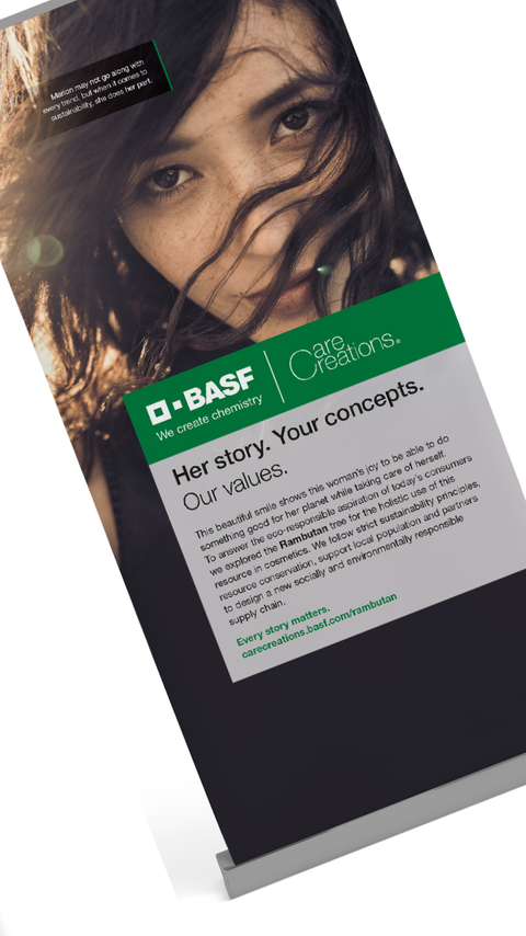
Companion brands may use additional individual design elements such as a specific image style, key visuals, graphic elements or additional coloring to support their communication of specific content and message.
Next you find an overview of various media and the usage of the individual brands in these media. Furthermore you get the overall guidelines for image and promotional communication (brochures, ads, roll ups, ...).
Please note: In functional communication (e.g., business letters) media specific guidelines apply. You find these guidelines in the defined section of the Brand Portal.


