Graphical Elements

The graphical elements are intended to convey a message visually and thus strengthen communication. Therefore, they have to be quickly recognizable and easy to understand.

Weitere Themen zu grafischen Elementen:


Our guiding principles

Easy comprehension is key

Whether charts, diagrams, icons or illustrations, communicate messages visually in the most direct and simply way possible to your target group.

Two dimensional style

Display information in a two dimensional graphic, smooth surfaces without textures, without shadows or gloss effects just for decoration purposes. Graphic elements and text boxes have sharp edges.

Deliberate use of color

One single color out of the six BASF corporate colors and tints of that color is recommended to be used in each graphic instance. Various shades can be created by brightening or darkening this color. If the complexity of the information requires the use of colors use one of the BASF corporate colors together with grey.

Symbols, icons and graphics

  • Use icons to portray a simple message to aid memorability and help improve communication. 
  • Use simple vector graphics with a minimum amount of details to convey the message.
  • Use a single corporate color on white background, or reverse out of a colored background.
  • BASF icons are solid filled shapes.  
  • Icons are used in positive or negative form.

Downloadcenter

Social Media Icons

On offline and online communication materials, social media icons can be used to connect people with BASF social channels. Please check the BASF social media strategy and guidelines to ensure an effective corporate presence among defined target groups.

For email signature, only a textual reference to social media is allowed with a link (no use of social media icons). Please find more information here.

Downloadcenter

More

Infographics

An infographic is the combination of an icon with explanatory text. The icon attracts attention and the text provides the respective message.

Use only one BASF corporate color or tints of it.

Preferred shapes for info graphics or their elements are circles, squares and rectangles.

Depicting people

Illustrations and Explanatory videos 

Every illustration should be consistent with the other elements in the communication. 

  • Maintain the natural proportions when depicting people. Base the proportions you use on the original photographs. 
  • Despite all abstractions, our illustrations should depict authentic people in realistic settings and real-life situations. 
  • No outlines, but shapes solidly filled with corporate colors or their gradations. 
  • Don’t emphasize outlines. Avoid decorative elements. Use a simple, reduced design.
  • The visual style defined for illustrations also applies to explanatory videos.

Diagrams

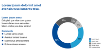
Use two harmonious corporate colors only per graphic unless the complexity of the message requires a third color, use gray. 

Use tints of the same color to differentiate information strands.

Charts

  • Use horizontal lines only. Thicker lines indicate the upper and lower ends and divide sections of the chart. Thin lines are used to divide rows.
  • Vertical columns are divided by leaving white space between them.
  • Table titles are formatted in the size of the body copy, but in bold.
  • Use a light tint of the corporate color used on the page to highlight the most recent and important figures.

Maps

Maps are drawn using single solid colors, derived from the corporate colors or neutral gray.


How to display lines, areas and text on maps